
Ava Arnett Design
Ava Arnett Design
Portfolio
Dig Deeper
This is one of my earlier full-game projects, built in a custom student-made engine, and fully 2D. We made it over the span of a year, and I served as ostensibly design lead and UX lead. In practice however, I acted as design lead almost exclusively for delegating tasks, and spent the majority of my time in art/audio asset production and UI/UX design.
This project suffered a persistent lack of hard limits and planning, so the core game design pivoted heavily throughout its 8 month development cycle, so with this entry I hope to highlight the evolution of expectations and how my UX work adapted with the project.

First Pivot
Starting around 3 months in, the player character started getting some more heavy influence, and a full-time level designer joined the project, so our level scope greatly expanded. This led to an "Exploration" element being thrown into the loop, rather than simply maneuvering in a small set of caves and digging small alterations in the terrain, a large explorable space with resources hidden in it was made. This meant that larger stationary UI wouldn't work, and pop-up menus were put in their place to avoid covering environmental objects.
This served for the majority of the development quite well, and still borrowed heavily from what came before it.
Second Pivot
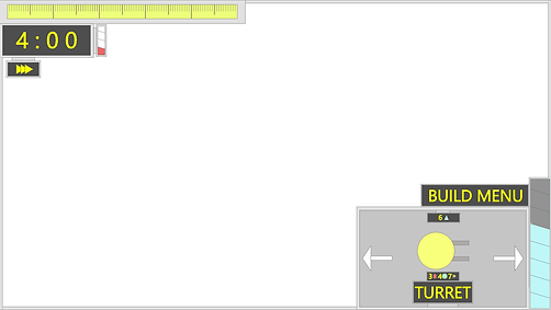
After a development pause during winter break, our systems designer came back with ideas for more exploration focus and less tower defense. This led to progression systems and multiple defense points being added as well as a player combat tool, allowing enemies to target the player and the player themself to fight back.
This was a major pivot for the UX needs of the game. Pop-up menus are nice, however anything intruding on the edges of the screen could easily cover enemies, a far greater risk in the now-action-involved player movement. More-so, because the moving between targets meant that enemies could catch you while exploring. All the elements of the initial UX were simplified down to their core elements here. Meters being too intrusive for exploration gameplay, and a pop-up build menu too much for fast, on-the-fly, turret placement as needed meant they were trimmed down to the placement UI and a smaller frame of the earlier build pop-up.


Where we started
Our initial pitch was a tower-defense game where the player takes agency in being able to mold the terrain to create new paths. A player character was an integral part of this, though initially they were entirely controlled outside of combat, with enemies avoiding them and no direct combat applications.
This led me to design several variations of UI for a tower-defense game, large blocky menus that would help track resources akin to the mobile tower defense games like Bloons Tower Defense. Resource tracking was a high priority, so I kept bars always present on the screen that would animate and make noise to fill as resources were gained or spent.


Final Product
The pivots of this project left me with a lot of ideas and iterations that bear almost no resemblance to the final product. And in a lot of ways, I feel that was for the worse. The idea got more complicated, and failed to capture a specific engaging niche the same way it might have been able to. However, through it I also ended up with a strong experience in adapting my work and rapidly developing and tossing elements that aren't worth keeping.